Power outages caused by major storms have captured the national attention again. First Quartile Consulting (1QC) conducted a series of webinars on storm restoration as part of our 2012 benchmarking program. One of the areas of inquiry was the average restoration time for major storms.
We set out to answer a few basic questions about storms: Why benchmark storms? What is the frequency and average response times for different magnitudes of storms? What magnitude of storms should be benchmarked?
We asked for basic data on all storms with greater than 1 percent of customers out and for detailed time series data on the two worst storms. Analysis identified methodologies that can be used to analyze what we termed “major storm” response (between 10 to 20 percent of customers out). Those methodologies include the following elements: Storm response as an aggregate of customers out and restoration rate; time series methodology and coincident peak; normalizing the time series as a percentage of coincident peak; composite benchmarks; and managing effects on the work force.
Why Benchmark Storms?
 We identified multiple reasons for benchmarking storms from the companies’ point of view: 1) Regulatory bodies and the public will be seeking comparative data after major events. Companies should be armed with supportable data before those requests are made; 2) Companies could use the data to obtain insight into their relative performance and improvement opportunities; and 3) By sharing data and using a common methodology, companies can improve their decision-making during major events, answering questions such as: What would be a reasonable global ETR goal for this event? And how many outside resources will we need to ensure that we meet that ETR goal? 4) Tracking the frequency and impact of storms over the years might provide some interesting insight into the impact of global climate change.
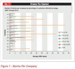
We asked 25 participating utilities for data on all storms over the last five years (2007 through 2011) where customer interruptions were greater than 1 percent of customers. This was a somewhat arbitrary low level, but represented a significant storm with fairly widespread damage for which internal company resources would be mobilized – but probably wouldn’t require mutual assistance. We received varying levels of participation on the questions. But a total of 13 companies provided information on 500 storms in which greater than 1 percent of customers were interrupted.
 As Figure 1 shows, the 13 companies reported approximate 500 storms of this magnitude during the five-year period. As might be expected, storms that affect lower numbers of customers are more common. All but two of the reporting companies experienced at least one storm with more than 10 percent of customers out. About half the companies experienced a storm with more than 20 percent of customers out during this period.
One client1 provided the following rough categorization scheme:
- “Significant”: Up to 10 percent of customers out. Work queues are deep but did not require mutual assistance. The backbone held up reasonably well except in localized areas. Reclose, isolate and switch operations were probably effective. The longest outage was 24 to 48 hours.
- “Major”: 10 percent to 20 percent of customers out. Damage is widespread and probably required mutual assistance. The response curve will suffer because the work queues are going to sit idle until off-system resources arrive. Still the backbones generally held and reclose, isolate, and switch operations were generally effective. There were more feeders affected and some had to wait longer to be switched around, but all in all the outages exhibit an exponential decay-like shape to the curve. The longest outage is around 100 hours.
- “Catastrophic”: With more than 20 percent of customers out, this is the storm that the company never forgets. It takes out transmission, damages substations, and snaps feeder poles. It broke the backbone. This is Ike, Katrina, Sandy, tornado clusters and extreme ice events. The restoration curve will look almost linear. Utilities can’t get adequate mutual assistance help as quickly as they would like because their neighbors are badly damaged as well. In these situations, utilities are all competing for the same mutual aid resources. Work queues are deep and they just sit.
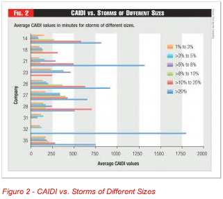
One measure of restoration time is CAIDI – the average minutes that an affected customer is without power. As shown in Figure 2, the average CAIDI increases with the number of customers out. This might be due to severity of the damage or constraints in available manpower. CAIDI is about 100 to 400 minutes for a 1- to 10-percent storm; it increases to about 500 minutes (six plus hours) for a 10- to 20-percent event; and is 1,000 or more minutes (12 hours) for a 20-percent event.
The different categories of severity and response times suggest different methodologies. For “significant” events, traditional responses and measurements can still be used. Most of these storms are not “major” events as classified by IEEE and are reported in typical SAIDI, SAIFI, and CAIDI methodology.
“Major” storms are typically outside the 2.5 beta range specified by the IEEE and are excluded from normal reliability reporting. These events are more rare, but occur often enough to benefit from a time-series analysis to identify typical response times and areas for improvement.
Past the 20 percent level, “catastrophic” storms are one-of-a-kind types of storms that occur infrequently, maybe every 10 to 20 years, with different levels of severity. The response times for these events will generally be reported to the federal and state regulatory agencies and will be heavily scrutinized. While benchmarking will provide some global comparisons, it is unlikely that annual benchmarking results will be useful.
A discussion of the public and private databases and classification schemes is beyond the scope of this article. But suffice it to say that there is as yet no agreed upon taxonomy, terminology, or methodology.
Methodology for the Worst Case
We asked for the time-series data on the two worst storms each company experienced in the same five-year period. We received detailed data from 11 companies on a total of 22 worst storms. It was not really surprising that we did not find an average storm or average restoration time. The storms varied on a variety of different parameters. These worst storms ranged from 1 percent to more than 20 percent of customers out at the peak. Much of our analysis concentrated on eight storms where 10 to 20 percent of the customers were out at the peak; these were not the largest storms, but offered enough data points to make reasonable like-size storm comparisons.
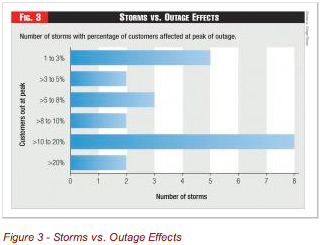
Our worst-storm analysis was concentrated on a small percentage of the 500 overall storms reported, but was heavily weighted with larger storms. A total of 22 storms were reported over the five-year period. We ranked the storms by percentage of customers out at peak, and found 12 were between 1 and 10 percent; eight between 10 and 20 percent; and two were greater than 20 percent (including 100 percent for a company in the path of Hurricane Ike). For comparison to the larger sample of 500 storms, the percentage of customers out at peak is less than the total percentage of customers out by a factor of two or three (See Figure 3).
 We asked companies to categorize their two worst storms and got a mix of responses, such as: Wind storm (5) with winds exceeding 60 mph; Thunderstorm (5) including straight line winds, hail, possible tornados, and violent thunder-lightning storms with high winds; Hurricane (3) including Irene, Aug. 28, 2011; Monsoon (3) with rain and wind; Snow (2), specifically a wet snowstorm; Ice (2) with “galloping” transmission lines; and Other (2), specified only by date.
Five methodologies were applied to better analyze and understand storm response. Each element in the methodology is briefly described.
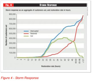
1) Storm Response as an Aggregate of Customers Out and Restoration Rate: The first step in an analysis is to gather time series data on the cumulative number of customers interrupted by hour and the cumulative number of customers restored by hour for each storm. The difference between these values at each hour is the number of customers still out. A typical curve for a particular storm might look like the example below. Each storm will have its own signature, but note that the gap between interrupted and restored is quite large, leaving many customers without power for extended periods of time. Understanding what happens in this gap is a potential improvement area for a utility: is it the time to wait for the storm to blow over? To mobilize resources? To safely commence work? To do a complete damage assessment?
 Efforts to model this process using reliability functions, such as failure rates and repair response are beyond the scope of this analysis, but are actively being pursued by utilities and others.
2) Time Series Methodology – Coincident Peak: One way to understand the storm and the restoration effort is to plot a time series for the number of customers still without power. As shown in Figure 4, this simple curve is actually the net of new customers without power and the number restored in each period. One way to compare different storms is to show them all with a coincident peak – in other words have the timelines coincided to the peak number of customers out.
To make better apples-to-apples comparisons, Figure 5 shows seven big storms where 10 to 20 percent of customers were out at the peak. (Note: the legend shows the company number and a letter to designate the particular storm). In the effort to mine the data to make useful comparisons, we eliminated one storm in this range that had a false peak – e.g., a second wave of outages occurred that exceeded the first peak. Also, companies were not uniform in reporting the number of hours prior to the peak. As a result, some companies ran out of hourly buckets and we had to do some smoothing. (Note: the time buckets change to 12-hour buckets at the tail of the graph, which makes the data look like it falls off a cliff at the end).
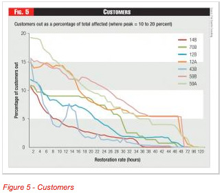 Even with these data problems, we were able to develop a reasonable picture of storm restoration activity. Again, there was no average storm. Some ended quite quickly; some dragged on; some had a secondary peak. Most did peter out after 48 hours, but some had customers out for five days. The best performance was exponential, whereby the restoration was more rapid in the early hours than in the later hours (perhaps due to sectionalizing and bringing on big blocks of customers early). The worst performance was almost linear, with a constant restoration rate.
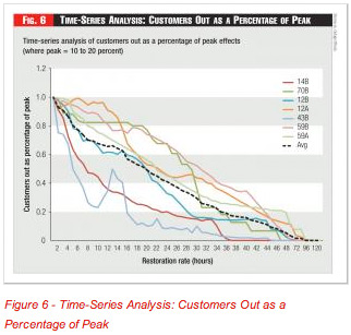 3) Normalizing the Time Series as a Percent of Coincident Peak: For the seven worst storms we analyzed (where 10 to 20 percent of customers were without power at the peak of the storm), we normalized the time series as a percentage of peak. The resulting graph (Figure 6) allowed the performance to be seen more clearly, but also magnified the differences in performance. The average trend line is very nearly linear, until the end, where the time buckets go from one-hour to 12-hour buckets.
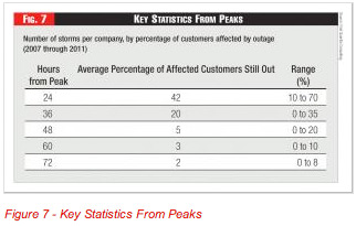
Figure 7 shows key benchmarking statistics measured from peak.
4) Composite Benchmarks: Several companies have reported success in using restoration curves for their historical storms as reasonably accurate predictors of future performance.
 Our experience with composite performance from multiple utilities is not so sanguine. The control lines around the average curve are quite wide – as much as +/- 100 percent for most of the time line. The lesson is perhaps that an individual utility can learn how its particular system responds to the types of storms it typically sees by developing and analyzing its own restoration curves. For the composite panel, the types of storms are quite different as are the demographics of each system and service territory. Also, companies design their systems differently based on their most probable severe weather risks; as one Canadian company commented, “we design our system for bad winter storms.”
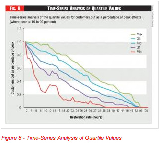
The benchmarks from the composite panel might still be useful to bracket an individual company’s performance. The quartile values for restoration are shown on Figure 8. Note the impact of a second peak in the data that was experienced by two of the companies.
A company that consistently performs worse than the panel might investigate the factors contributing to this performance. However, it should be understood that the control limits are very wide and should not be taken directly as a measure of storm restoration performance, but instead as the consequence of storm severity, system integrity and other factors as well as the efficiency of the storm restoration process itself.
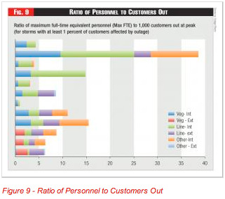
5) Work Force Effects: The restoration rate would also logically seem to be affected by the available workforce. The critical resources are lineman and tree personnel, but other internal resources can be significant – e.g., damage assessment, drivers, wire guards. We asked companies for each storm to report maximum number of full-time equivalent (FTE) personnel in these categories, and to distinguish between internal resources (company employees and regular contractors) vs. external people brought in.
We received useful FTE data for 12 worst storms. Figure 9 shows a ratio of the maximum number of FTEs per 1,000 customers out at peak; the range is from 1 to 38 (including one very high value, and one very low). This ratio does not necessarily measure worker productivity, since some restoration work can be done automatically and in large sections.
Figure 9 provides a general sense that linemen and tree workers are about evenly matched, that other internal resources can be significant, and that external resources were generally a small factor for most storms. Companies that reported no internal tree trimmers probably misunderstood our instructions to include regular contract crews as internal resources.
The chart is sorted so that the smallest storms are at the top of the graph, and the largest at the bottom. There is some apparent correlation between maximum FTEs and storm size; it would seem reasonable that bigger storms are more constrained on resources.
Several of the data points were paired – four companies provided two data points. When the storms were similar size, the max FTE/customers out at peak ratio was similar, which suggests a consistency in response.
Understanding Outage Performance
Our effort to benchmark major storm restoration helped us develop several interesting findings. While we concluded that there was no such thing as an average storm, we did identify ways to analyze storm restoration response that should be of assistance to utilities in understanding their performance. Additional storm data collected through an annual T&D benchmarking program will allow us to update the analysis.
Additional research is needed in the area of understanding the underlying impact of storms on failures in the system, as well as the utility repair response. There is also a need to inventory existing databases on storm performance and develop some consistent guidelines.
Composite benchmarking data, when presented in a consistent way, can give a utility an idea of its comparative performance. However it should be understood that differences in storm restoration performance may be attributable to differences in weather, geography, system design and system condition as well as differences in how companies organize and manage their storm restoration efforts.
About the Authors: Tim Szybalski (tim.szybalski@1qconsulting.com) is a director at First Quartile Consulting (http://1stquartileconsulting.com), a management consulting firm that also performs annual benchmarking studies for North American utilities. Dave Carter (dave.carter@1qconsulting.com) recently retired from We Energies and is now a part-time contributor to First Quartile Consulting’s benchmarking studies and consulting projects. The authors acknowledge the contributions of Jesse Medlock, Robert Jones, and Rocky Morris at Oncor.


